The Kabir Project
Srishti School of Art, Design & Technology
Bangalore, India
Identity Design for the Project
The Kabir project brings together the experiences of a series of ongoing journeys in quest of this 15th century north Indian mystic poet as well as other Bhakti and Sufi poets in our contemporary worlds. Started in 2003, these journeys inquire into the spiritual and socio-political resonances of Kabir’s poetry through songs, images and conversations.
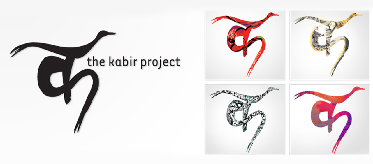
Kena team approached the logo design process to reflect the earthiness and simplicity of the message underlying Kabirian themes and ideas. The logo design uses the calligraphic form of Devanagri letter ‘K’. The calligraphic form is rendered to be spontaneous, free, unpretentious and rustic. Combined with the form of a bird replacing the ‘shirorekha’, the logo works to reflect the Kabirian spirit of simplicity, self-interrogation, limitlessness, formlessness, and quest for freedom. Forms and Flavors of journeys of “Many Kabirs” are communicated as the logo takes on the colours and forms of these diverse cultures and spaces.
#branding
